Showing posts with label contemporary art. Show all posts

09 March 2014

There's a head case on the staircase

Work No. 1059: The Scotsman Steps from 2011. The artist is Martin Creed. If you don't know about him, that's okay, because I'm going to tell you. But first, listen to him (there's singing!):


Martin Creed is, to put it plainly, a Scottish contemporary art rockstar. It's true; he has a new album out now. He won the Turner Prize in 2001 for his work entitled Work No. 227: the lights going on and off, which has been acquired recently by Tate Britain. I saw it last December. And with that, it is what it sounds like: the lights going on and off. The gallery room is empty and the lights flick on and off at five second intervals. Sounds like art, right? And like the best art, it's controversial, as it has been since it won the prize in 2001. It can be written off as a joke, a jab at the art establishment by making a commentary about the gallery itself. There is nothing on the walls, just blank white. Instead of paying attention to something in the room, the visitor has to pay attention to the room and what we normally expect to find there. Actually, I find this brilliant, so I think the Turner Prize was rightly won, and with that... moving on.

Martin Creed, who moved to Glasgow when he was a child, was born in England, and studied art in London. But to hear him, you identify his Scottish accent right away. Edinburgh is home to one of his permanent public art installations, The Scotsman Steps. (ie. Work No. 1059) It's a marble staircase in the corner of what is now the Scotsman Hotel (previously home to The Scotsman newspaper) that connects the upper level of North Bridge to the lower Market Street. It's also just kiddy-corner to the Fruitmarket Gallery which commissioned the piece.

// via //

shiny and new // via //

It consists of 104 marble steps from all different locations and of all different hues and patterns. They appear to be arranged randomly with no discernible pattern. The stone is really gorgeous, even littered with cigarette butts from hundreds daily passers-by and dead leaves blown in from who-knows-where. If you didn't know that an internationally-renowned contemporary artist had been commissioned to revive the steps, which had fallen into neglect and become somewhat unsafe, you might not even view the steps as art. To the casual pedestrian, they just look like nice slabs of marble to make a colorful stairway. In fact, I'm pretty sure that's part of the idea.

It also smells like pee.

If you stop long enough to appreciate the stairwell, you'll also appreciate other aspects of it as a stairwell that are much more related to it being a civic space than a piece of artwork. Other than smelling like pee, and the cigarette butts and crisp packets (let's be Scottish for the sake of this post), it gets rained on and is subjected to the dirt and grime of the bottoms of pedestrians' shoes. How many people who piss in that stairwell know they're doing so on a piece of fine art?

I think this is why Martin Creed isn't necessarily a jokester. It's hard to imagine he didn't take these things into consideration when he was commissioned to do the piece. Just like he didn't just flippantly turn the light off in a gallery space and call it art. There was a reason for it and some sort of more refined comment he was trying to make. His tendency to come off as flippant or jokey is, I believe, a product of much careful consideration and planning, knowing just where and how much to jab at the 'art world' to get the desired effect without cheapening the work or the process.

Hayward Gallery's Martin Creed: What's the Point of It? is on through 27 April at Southbank Centre, London.

Cheers!
Kate xx


20 February 2014

Studio visit: Callum Innes

Image (and more) via Braidwood Building Contractors

There are a couple of reasons I enrolled in Scottish art history courses this year.

1. I'm in Scotland. This should seem obvious, but just like in any other university anywhere, the history of art department at the Edinburgh College of Art/University of Edinburgh is varied in its focus and scope. It's a comparatively large department with experts in Renaissance and Middle Ages, architecture, Chinese art, contemporary art, curating, 19th century painting and the list goes on. Additionally, there are a number of professors whose expertise lies in Scottish visual culture. No matter where you are or what you're interested in, I think it's a good idea to look into local and regional-interest courses as much as possible because it's the sort of educational experience you won't be able to get anywhere else.

2. The beauty of having people who are specialized in an area that you happen to actually be in is that there are many, many more opportunities to get out and see things in person. I took a Scottish architecture course last year and was able to hop on a train to see some castles on the west coast that I was writing about for my essay. And currently I'm taking a course on Scottish art from 1960 which covers a selection of some of the greatest contemporary artists to emerge out of Scotland, and Britain as a whole, in the last fifty years.

So how does it get better than that?

3. Combine 1 and 2, and you get the best possible outcome. Not only do you have professionals who have been working in the field for decades, but in many cases the art that you're discussing is still being made by these artists. Take a professor who's been an art critic and a curator at a number of institutions around the UK and you'll find connections to artists who are top of the heap in the international art world. So when you're taking a class with one (or two) of these professors, why not let them set up a field trip to see some of the art work available in the city and visit the studio of one of the artists discussed in the course? Why not meet the artist! See his work, his process, his studio! Listen to his ideas and his feelings about his art! Get out of your stuffy library and smell the turpentine!

It's a totally different experience in a studio setting with an artist trying to put words to his process than it is to sit in a cold, academic room in front of a PowerPoint presentation, trying to theorize why it looks the way it does. There are merits to both, but I think one of the key things to understand as an art history student is that there are two parts to that: the art and the history. There can be very, very different ways of looking at the subject as a whole.

Taking an extremely long time to get to my point, last week we visited artist Callum Innes' studio in Edinburgh where we spent well over an hour listening to him speak about his painting process, previous projects and how he feels about his previous work, and about his artistic trajectory in general. He had an amazing top-floor studio space with tons of natural light coming through skylights. There was oil paint splattered everywhere, the smell of turps was strong, and several paintings were hung on the walls waiting to dry. Since oil paint takes a long time to thoroughly dry, some of them had been there for months already as he worked on them, layer by layer.

Callum Innes was born in 1962, studied Gray's School of Art and earned a postgrad degree at Edinburgh College of Art. He lives and works in Edinburgh, represented by galleries internationally and exhibiting his paintings in group and solo shows worldwide. Innes was nominated for the Turner Prize (the topmost annual British contemporary art prize) in 1995 and has won several other prizes. Four years ago he had an exhibition in New York at Sean Kelly Gallery which displayed a salon-style array of his watercolor paintings, and Man Booker Prize nominated Colm Tóibín wrote a short story for inclusion in the catalogue.


Cobalt Turquoise / Scarlet Lake, 2012, watercolor on paper

Installation view, Callum Innes | Colm Tóibín: Water | Colour
16 Dec 2010 - 29 Jan 2011, Sean Kelley Gallery, image via ArtNews.org

Innes' process is tied firmly to history. These are modern paintings, some of which easily harken back to, like Untitled No. 71 below, Robert Rauschenberg's white paintings or Barnett Newman's 'zips,' but he takes it a step further. Or, in effect, a step further and then another step back. For me, the crux of Innes' work is, in addition to the 'construction' or layering of paint, is the deconstruction or un-painting. He will spend hours layering on a fine, smooth layer of paint, often paired with another color on half or a portion of the canvas. He'll then use turpentine to remove a layer of color on one side, revealing again the color beneath it, but not without leaving a bit of the topcoat's history there along the edges and in the texture of the paint surface.

The watercolor paintings above are an example of two layers of watercolor paint laid down and then removed to reveal their combination after being 'undone.' 

Tate did a really fabulous TateShots visit to his studio about three years ago in which he gives a brief tour and also demonstrates his watercolor process:


Untitled No. 71, 2010, oil on canvas

Three Identified Forms, 2008, oil on canvas

Installation view, Callum Innes: Works on Paper 1989-2013
28 April 2012 - 14 July 2013, Ingleby Gallery

I was really thrilled to be allowed an a peek inside this artist's work space and some insight into his process. I encourage you to take a look at his work. What do you think? Do you like his work? Is there anything you don't like about it?

All images, unless otherwise noted, are via Ingleby Gallery, Edinburgh.

Cheers!
Kate xx

06 February 2014

The art of Karborn

"I'm not a digital artist. I'm not an illustrator. I'm an artist."

I want to share with you Karborn a.k.a. John Leigh, London-based multimedia artist. He's an enigmatic guy with a splendid and large portfolio. His work is very graphic, edging on illustration one moment, seizing the urban environment in another, following a thread through digitalization and college and film and pop culture the next. Some of his work has an almost ethereal quality while at the same time a bit jarring. Depth is uncertain. The collage aspect of a lot of the work defies that there are segments that take the viewer back into space, or deep into, perhaps, nothingness. The enormous void of the digital age? The void of perception? (Who's to say?)

Love it. Check out some of the images here, and be sure to check out his Cargo Collective page where you can see a number of films and additional images.

Praylouder

Royal Nude

Voler de Nuit

Pauses Sunsetter Golden

She Dreams Sisyphus / Le Mythe de Sisyphe

Prints available for purchase

Cheers!
Kate xx
30 January 2014

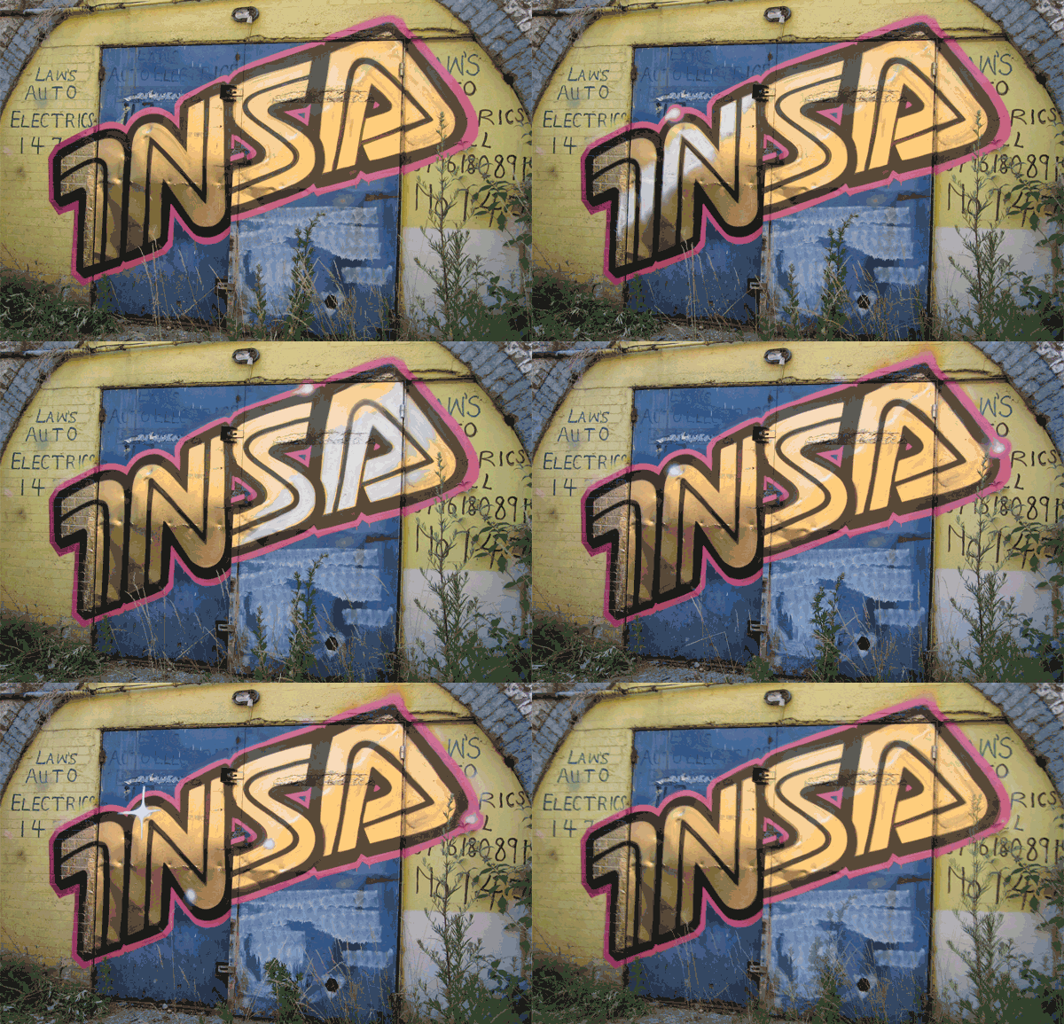
Insa's intense GIF-iti

// via // 

// via //

Summer Spectrum, 2011 // via //

// via //

// via // 

Make Your Own Way, 2013 // via //

// via //


Insa: an artist or a collaboration? I don't know, really. Perhaps mainly one guy with some collabs along the way... Most articles refer to 'him' and the official site says 'artists,' but either way, I was instantly drawn to these images that I started to see going around the internet. 'GIF-iti,' if you will, by the UK-based artist(s). Full-fledged street art with the added dimension of the tech edge. And if tech could be kitsch, then I think, here ya go! And I mean kitsch is the best possible way. No matter how many write-ups I saw on this artist, I couldn't help being rather amazed at every image I scrolled to. Some are amusing. Some are technically inspring. And some are just plain rad. So it's well worth checking out the official site, because there's a lot more to Insa than just paintings on walls. There's a shop and everything. Worth a look, proooobably NSFW. ;)

Cheers!
Kate xx
23 January 2014

Final days: Man of the Year

Exhibition: Man of the Year: Henry Coombes and Carles Congost
On through 26, 2013 at the Centre for Contemporary Art, Glasgow

Still from Carles Congost, Paradigm, film, 2012 // via //


Clip from Carles Congost, Paradigm, 2012

One art exhibition that took me by surprise was one that I mentioned a few weeks ago when I took an afternoon gallery-hop visit to Glasgow, and one of our stops was the CCA. I mentioned then, and I'll say it again, that I've always been a little on the fence about the moving image when it comes to art exhibitions. I've been to countless museums and galleries, and almost always stop into the inevitable darkened room that sits on one end of the exhibition space. It's hard to resist seeing the source of the strange noises that echo through the galleries.

I think the moving image, film art, video art--whatever you want to call it--is an art form I've simply had a hard time wrapping my head around. I've only begun to seriously look at it. Call it personal preference, or lack of understanding. I might as well just be honest about that rather gaping void in my understanding of art and its history. But on the other hand, perhaps I just haven't seen things that 'spoke' to me. Perhaps I walked into too many gallery screening rooms at the wrong time, didn't stick around long enough, and left feeling more and more confused and disinterested. Like any other kind of art, film art can vary dramatically in style, length, presentation size, theme, etc. Sound becomes an essential element, and notable when there is none.

Anyway. I could go on forever about how art films have suddenly captivated me in a way I hardly know how to express, and strangely it is because of two films by two artists that I saw nearly two months ago at the same time. I saw both films twice, in quick succession, and perhaps, just maybe, this is why I have considered them so much since. It's unusual for me to continue coming back to artwork of any kind, trying to piece it apart and back together, to interpret it, to comprehend it in some way. (Unless I have to. I know this sounds weird, since that's what all this art history business is about, but that's that.) But, flipping over to movies, or a book, where there's a narrative and a moving image (if only in my own imagination), there are certain films and scenes from films that stick with me for some reason. I roll them over in my mind, sometimes disliking them at first and then finding that they challenge me in some unforeseen way, and after some time I come to really appreciate them. I think the same may go for film art. I need to really spend some time with it in order to learn how to appreciate it.

Above is a short clip from Paradigm. The other film in this exhibition, screened in the same room, on the same scale, and alternating back and forth with Paradigm, was Henry Coombes' Two Discs and a Zed. This is the one that initially weirded me out a little bit, with scenes of the Highlands and Coombes himself dressed as a Pictish man in a cave, chanting and then shown being wrapped in plaster and turned on a spit, interspersed with rather romantic scenes of a wolf running around the National Galleries of Scotland, picking meat off a heavily draped table. But it was also the one I wanted to see a second time in order to try to pick it apart myself. I've had a still photograph from a scene of the wolf, which was printed in the exhibition program, hanging in my room and I am still entranced by some of the imagery in this work. It doesn't seem that Two Discs and a Zed is available to view on his site as yet, but his other films and work are available there.

Image of wolf from Henry Coombes, Two Discs and a Zed, film. // via //

Paradigm has a highly produced soundtrack, and the figures in the film move in slow motion, sometimes singing along with the lyrics. At first I thought the highly-produced, strange music video-like quality of it was cheesy, but then on a second viewing it gave me pause to reconsider. One of the other students I was with referred to it seeming 'forced.' The concept of 'forced artwork' sort of jarred my brain. I started to wonder what it meant for an artist to 'force' work, or for a work to appear as such. Does the quality 'forced' even exist in art? And how? Is it a personal, subjective interpretation? I almost thought the same thing, if by 'forced' she meant 'highly produced.' Not what I think of when I think of video art -- grainy videos (think Andy Warhol or Fluxus). I wonder if the student hadn't criticized it that way, whatever her reason, I might not have thought so hard about it myself.

After a few weeks, I wish I could both again. I wanted to share these two videos again and offer some of my own thoughts on film art, using these two, or the Man of the Year exhibition, as something akin to a case study in my ever-evolving and growing understanding of art, especially of the contemporary kind.

Cheers!
Kate xx

16 January 2014

Zaria Forman Pastels

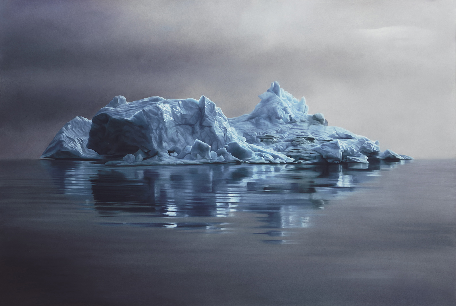
Greenland #62, Soft Pastel on Paper, 2013, 47"x70"

Greenland #56, Soft Pastel on Paper, 2013, 40"x60"

Maldives #5, Soft Pastel on Paper, 2013, 45"x60"

Maldives #2, Soft Pastel on Paper, 2013, 41"x60"


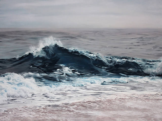
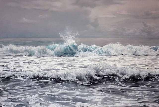
I wouldn't say that I prefer a monochrome palette, at least as a rule, but when someone can pull off a series of iceberg or surf paintings, what it says to me is that they have immense control of color. Sometimes monochrome and sometimes not, depending on the conditions, snow and ice, the sea, large expanses of grass, etc. can be a challenge to fill a large canvas, especially with a limited palette. I think that's one reason I was drawn to Zaria Forman's large-scale pastel drawings, especially the more recent Arctic ice and sea paintings from a 2012 trip to Greenland (which she led, cool lady!). I also like the series of drawings of the Maldives, which, like the Greenland drawings, comment on climate change in two areas that are most obviously already affected and predicted to see some of the most intense impact.

I've always been, and will probably always be drawn to images of the sea. Wide expanses, reflections, horizons, frothy surf, breaking waves... Part of it is having an early connection to the Pacific coast, but my dad has also painted the ocean throughout his career as an artist. And the oceans, so vast yet delineated on every map, are still an incredibly mysterious and powerful force on our little planet.

Forman's handling of pastel is fantastic. I didn't even know it was pastel--I had automatically assumed oil. In this case, due to the scale and the material, I feel that these would absolutely be best appreciated in person, since pastel is such a challenging medium. Amusingly, some of her drawings are featured in the Netflix Original Series House of Cards, season 1. Check out Forman's exhibitions here with more screenshots of the work featured in the show.

I love the moody intensity. An iceberg sitting on a calm sea is almost too isolated, and knowing Forman is interested in climate change, it's hard not to imagine being able to hear hollow cracks, or waiting in suspense for the moment when the calm sea is disrupted by falling ice. Her surf paintings are cool and dramatic, capturing the same intensity in the brief splash of a wave or one about to break. Far from being "pictures of water," they are sensitive to the environment, to the light. I'll definitely be keeping an eye on her work from now on.

House of Cards, Season 1


Cheers!
Kate xx


09 January 2014

Kate MccGwire

I think Kate MccGwire might be so high on my list of favorite contemporary artists that... she might be on top. And there she's among good company. ;) I love her work, and I've been following her for a couple of years now. The first image I ever saw of her work was this one:

Slick, 2010, Mixed media with magpie and crow feathers 
and antique fire basket, 50 x 250 x 250cm

Retch, 2007, Mixed media with pigeon feathers, 200 x 120 x 70cm approx.

Vex, 2008, Mixed media with pigeon feathers
in an antique museum cabinet, 183 x 110 x 83cm

FINE (Fucked-up, Insecure, Neurotic and Emotional), 2012, 
Mixed media with crow feathers in antique cabinet, 158 x 155 x 57cm

Shroud, 2013, Mixed media with mallard feathers and quills 
in antique dome, 35 x 35 x 30cm

Call me enthralled. Her work just puts me in a different place. From her large installations to her more recent smaller works, there's something so mysterious about her forms. Using natural materials, mostly feathers, and putting them into antique display cases and glass domes gives them a sort of natural history museum or curiosity cabinet feel. And although the feathers appear soft and the colors understatedly beautiful, the shapes take on a menacing quality, like a coiled-up snake. The quills add a sharpness as if there's something alive and hidden inside those feathers, that if you got too close it would be unleashed. I love the juxtaposition of beauty and gentleness with the uncertainty of a possible threat or sharpness. Her large installations are creepy and beautiful at the same time, where the luxurious iridescent luster of the feathers only momentarily distracts from the way the unknown shape seems to slither out of the fireplace.

Lately her scale has become a bit smaller, but I'm really interested to see how she continues to explore scale and materials as she moves forward.

All images via katemccgwire.com - please, please go check out her fantastic site!

Cheers!
Kate xx

02 January 2014

Alex Roulette

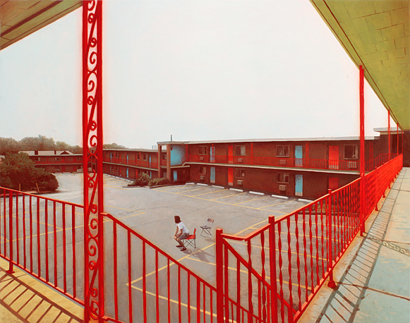
Waiting, 2012, Oil on panel, 28in x 35.5in

Alex Roulette, Smoke Bomb
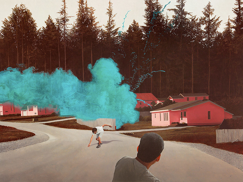
Smoke Bomb, 2012, Oil on panel, 33in x 44in

Installation view of 'Freeway's Reach' 
at George Billis Gallery, Los Angeles, CA, January 2011


I'd like this post to kick off what I hope will be a weekly post on an artist, or a collection of works, or a show, or something arty going on in the world... that I'd like to share. Since I'm an art history major, it sometimes feels like all I think about is art. But within the world of art, focus can vary so much. I bounce between ancient and modern, middle ages and contemporary. It's all over the place, and I like so much of what I see, here in Edinburgh, abroad, and online. I just want to carve out a tiny space on this blog to highlight artists and work that really speak to me -- for whatever reason. They may be big-timey artists or they may be illustrators, or they may just be showing their first work. I'm all for it, and if I like it, I'd like to share. :D

Firstly, I just came across this artist Alex Roulette, a young painter who just earned his MFA in 2013 from Columbia University. His artist website is wonderful, so it's worth checking out. He paints rather uncanny, photographic images that give the impression of a dream or a memory that seem realistic, but with a twist. The perspective is sometimes a little skewed, like a camera's wide angle, the color a little strange. There's drama roiling just beneath the almost apparently calm surface. The places are recognizably everyday sorts of places--motels, neighborhoods, roads--but the solitary figures, saturated hues and photographic perspective make us think twice about what's really going on.

I love the texture and the way he handles the paint. In some places it looks thin, in others dabbed, and sometimes textured, but always solid. The colors pop and play against one another. In Waiting, the blue doors and yellow ceiling jar with the bright red, and frame the neutral grey parking lot where a figure rises as if something has just drawn his attention. Perhaps someone or something he was waiting for is arriving? In Smoke Bomb, the smoke is a bright turquoise that complements the Pepto-Bismol pink of the houses against a neutral, wall-like forest in the background.

I'll definitely be following Roulette's bright future. (All images via alexroulette.com - please check out for wonderful hi-res images and details, plus past work!)

Cheers!
Kate xx

04 December 2013

Gallery-hop in Glasgow

12042013-1

So you're postgraduate student and your first big essay of the term is due tomorrow. What do you do? Well, you could re-re-re-revise your essay, or you could take a train to Glasgow and go gallery hopping! It's school-related after all, you know!

That was my story yesterday (and yes, that means my essay was due today, and it's been checked, double- triple- septuple-checked and submitted)... A small group of art history third-years (third year undergrads, but basically seniors) were being taken to Glasgow and the professor, who will be teaching one of my classes next term, invited any interest postgrads to attend as well. I just couldn't pass that up. I hadn't been to Glasgow, let alone any of the museums and galleries, and to have a tour guide who used to curate shows in them, well... you just don't get better than that.

It was a four-hour whirlwind trip through the Gallery of Modern Art where a fine collection of Ian Hamilton Finlay prints were on display.

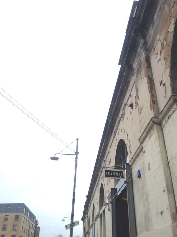
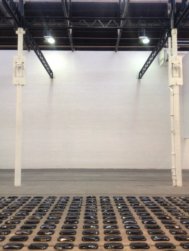
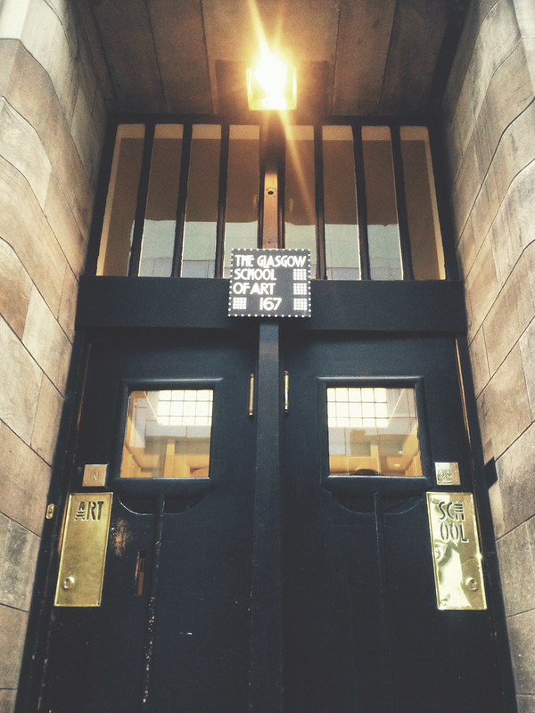
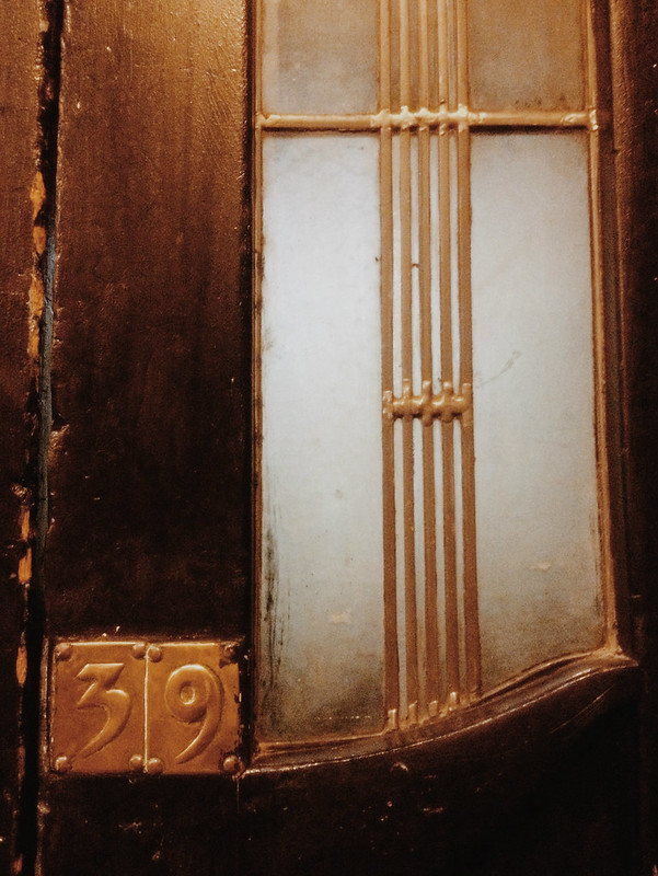
Then it was back on the train promptly to head to Tramway, where we spent most of our time taking in Lucy Skaer's installations in her show, Exit, Voice and Loyalty. It was then back to Glasgow Central and we detoured around Charles Rennie Mackintosh's nouveau masterpiece of a building that is the Glasgow School of Art, taking a peek in the gallery's current exhibition, Interwoven Connections: The Stoddard Templeton Design Studio and Design Library, 1843-2005 but spent most of our time admiring Mackintosh's incredible eye for detail.

Then we hopped over to the Centre for Contemporary Arts (CCA) where we took in Man of the Year, a joint show of Glasgow artists Henry Coombes and Carles Congost. I admit it was the first time I found not one, but two art films quite entrancing. They were meant to complement one another and were highly produced, even musical films... really interesting. This, coming from a girl who has always been extremely wary of video art, partly because it always seems so forced... perhaps it's just that 'forced' quality, whatever that means, that I have to come to terms with.

Anyway. All photos were taken with my phone. I admit I'm getting spoiled... it's just so much easier to pull my phone out of my pocket than lug around the camera... and the camera's not even that big! Like I said... spoiled.

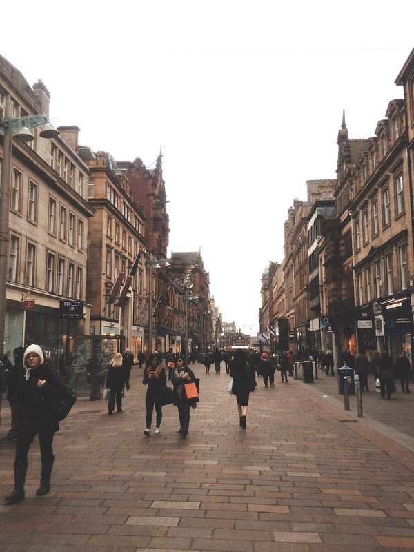
It was such a brief trip to Glasgow, but I was able to get a feel for its downtown area and look forward to being able to get back there and check out more shows in the future. And by 'shows' I mean anything entertaining... we did happen to pass by a theatre where Hanson was playing! (Anyone else in their late twenties remember them? I felt suddenly extremely old when there were early-twenty-somethings who had no concept of "Mmmbop." DOES THAT HAPPEN?? Perhaps that is a topic for another time. Haha!) But aside from that clear trip down memory lane, Glasgow is largely the destination of choice in Scotland for edgier music and contemporary art. So it's a place I'm sure to get back to eventually.

Lucy Skaer and Tramway...

12042013-3 12042013-8

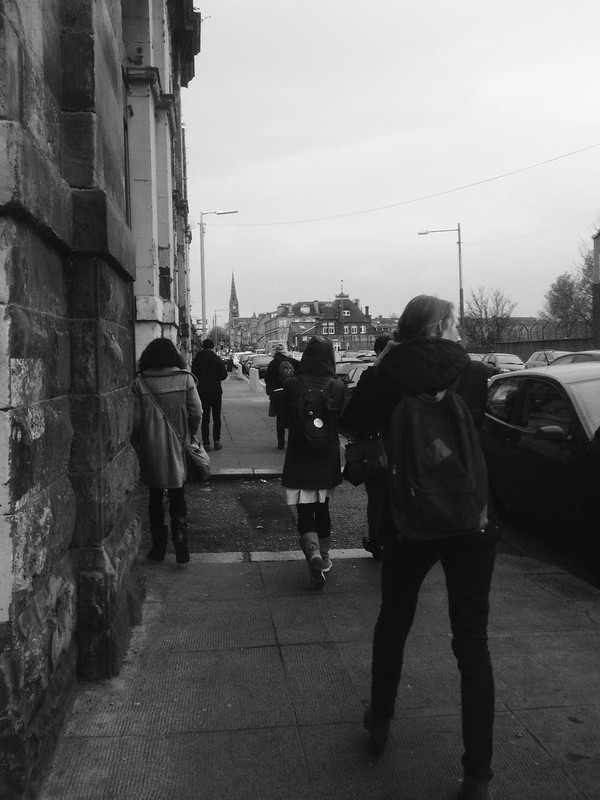
Walking around Glasgow...

12042013-7 12042013-6 12042013-2   12042013-9 12042013-10

...and Charles Rennie Mackintosh and the Glasgow School of Art:

12042013-512042013-11 12042013-12


Cheers!
Kate x
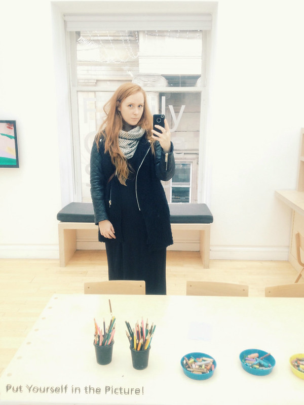
P.S. Hello from GoMA! (I had to put myself in the picture. It told me to, although perhaps they had the pencils-and-paper in mind, but I was in a hurry!)

12042013-4

01 November 2013

I Give Everything Away

10312013-2

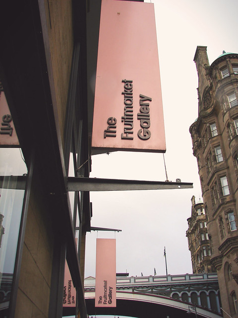
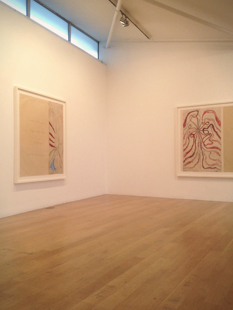
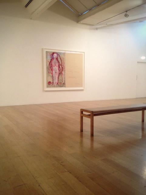
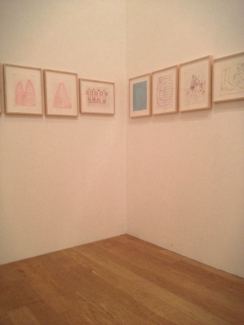
The other day I hopped down the hill to one of the best contemporary galleries in Edinburgh, The Fruitmarket Gallery, where they just opened a new exhibition of Louise Bourgeois works to complement a major exhibition at the Scottish National Gallery of Modern Art. I'm actually not sure I've ever seen any of her work in person before this, so I'm excited to get to the Gallery of Modern Art as well. The exhibition is titled I Give Everything Away, after a suite of large drawings by the same title on display. The Fruitmarket exhibition goes through February 23rd, 2014.

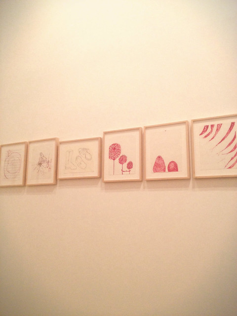
The Fruitmarket Gallery exhibition presents Bourgeois's Insomnia Drawings, 220 drawings made in that blurry phase between sleeping and waking. She used sheets of paper that she had on hand, including sheets lined for music and lined notebook paper, and did combinations of writing and drawing that are at times very personal. The clustered line of drawings wends throughout the rooms of the ground floor, roughly in chronological order, starting in November 1994 and ending in June 1995.

On the second floor (first floor if we're in the UK; this gets confusing) there are larger works on paper made at the end of her life, in 2010. They are a mix of hand-colored etching, writing, and drawing which were, to me, a bit more evocative than the snake-like procession of Insomnia Drawings downstairs.

It's a really wonderful exhibition in a fantastic space. I like very much how the first floor is almost overwhelming, "labyrinthine" as the info pamphlet says, in the sheer number of pieces and how tightly they're displayed. The other part of the space is much more open; the works on display and the two different exhibition spaces really complement each other that way.

10312013-3 10312013-1

The Fruitmarket Gallery has also published a catalogue to accompany the exhibition, titled Has the day invaded the night or the night invaded the day? Insomnia in the work of Louise Bourgeois. They have copies sitting around on benches throughout the gallery and it's a really beautiful little book with many of the Insomnia Drawings shown both sides, where in the gallery they are obviously only able to display one side of a sheet of paper.

10312013-4 10312013-5

Cheers!
Kate x